We used many different technologies when constructing our film, to help us with planning, filming, editing and producing.

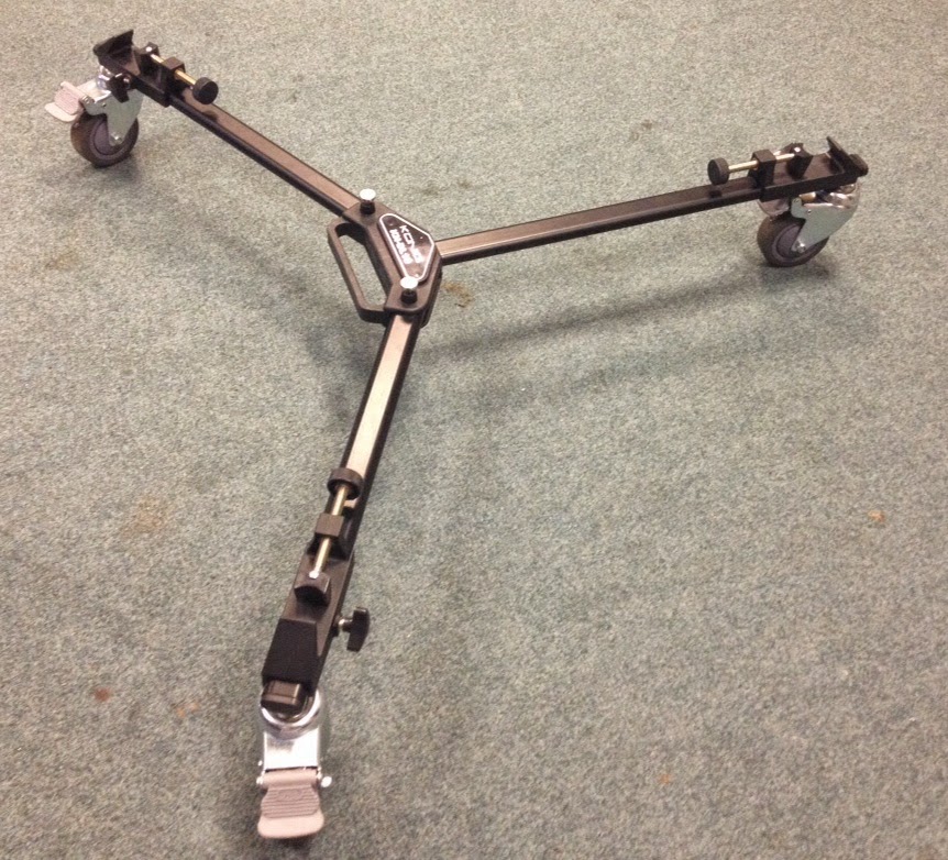
The camera, tripod and dolly were some of the most important pieces of equipment when creating our title sequence. This equipment was easily accessible as we could borrow it from school. None of our scenes involved filming outside of school so we didn't need to borrow any equipment however we learnt very quickly how to use the camera meaning that if we had needed to have taken it home then we wouldn't have had any issues in terms of knowing how to use it. While using the camera, we learnt how to achieve certain shots such as a close up and a long shot. Close up shots of the phone, for example, were very significant to the story. Therefore it was important that the shots were clear and good quality - if the writing on the texts was not readable then the story would not have made sense. We also learnt the importance of properly attaching the camera to the dolly as some of our footage ended up being extremely shaky because of this.
.JPG) The Apple Mac Computers were also incredibly important in terms of creating our title sequence as this was where we edited our footage. I had never used a Mac before so I learnt a lot from this. Firstly I simply learnt how to use a Mac - they were confusing at first because they are so different to PCs. However, we picked up on the basics very quickly (turning it on and off, logging in, opening the appropriate programmes). After a while we began to pick up on the short cuts on the keyboard which helped speed up the editing process. We learnt where pictures and other data we needed was stored on the system, making it easier to locate anything we needed for our film opening. Lastly, we learnt how to share our projects so that we could transfer them from the Mac to the school system.
The Apple Mac Computers were also incredibly important in terms of creating our title sequence as this was where we edited our footage. I had never used a Mac before so I learnt a lot from this. Firstly I simply learnt how to use a Mac - they were confusing at first because they are so different to PCs. However, we picked up on the basics very quickly (turning it on and off, logging in, opening the appropriate programmes). After a while we began to pick up on the short cuts on the keyboard which helped speed up the editing process. We learnt where pictures and other data we needed was stored on the system, making it easier to locate anything we needed for our film opening. Lastly, we learnt how to share our projects so that we could transfer them from the Mac to the school system. When using the Macs, we used Final Cut Pro X to edit our teen angst footage. When using Final Cut Pro, we learnt a range of editing techniques. For example, we learnt how to add transitions between shots and how to add titles. This was very useful because it helped us improve our title sequence and opening scene. We also learnt basics such as how to piece our film together by rearranging, cutting and deleting footage. When we realised that we'd filmed two shots with completely different lighting despite the fact that they were supposed to be edited into one another meaning that we had to either refilm or correct the colouring on the footage. Luckily, we realised that we could match the colouring between the two scenes so that the colouring was the same, so we learnt how to do that which helped us again later on in the editing process when the same thing happened again. This saved us from having to refilm a scene that took a long time to film in the first place. Lastly, we also learnt on Final Cut Pro how to speed up and slow down footage which we used at different points throughout the film.
We used a voice recorder to record our voiceover and was perhaps one of the simplest pieces of equipment that we used, however we still had to learn to use it. We learnt how to record, stop and playback our recording. This was useful because it meant we could add a voiceover to our title sequence, which is a convention of teen angst movies - it is used in Mean Girls and Easy A. It also meant that we could record our voiceovers for another part of our evaluation. We learnt that the voice recorder had a huge amount of storage space so recording more than once in order to get the right voiceover was not a problem.
 Blogger was a very important part of creating our film because we made all our planning and research on Blogger so that everything was in the same place. It was easily accessible from the computer, an iPad and a phone. However, we learnt that we could not access Blogger on our usual school accounts, as it was blocked. Therefore, we were all given separate media accounts on the school system. We also leant that Blogger only worked on Mozilla Firefox. We could use Blogger to receive feedback from our teachers, to help us improve. When using Blogger, we learnt how to add pictures, videos, and other links, as well as how to change the font, text size, text colour and text style. Another thing I learnt about Blogger was that it was very difficult to insert photos exactly where I wanted to which meant I had to adapt to this and find the most appropriate place to put the photo.
We used iTunes to download the song for our title sequence (Jump by Charlotte Campbell) after getting her permission on Facebook. However, we struggled to download the music and transfer it to Final Cut Pro. We learnt that we had to select the option of 'Trusting this Computer' if we wanted to download from my iTunes account via the Macs. At first we were unsure how to do this, so with permission we logged on to the admin account of the Mac. When this didn't work either, we looked at the settings, and realised that we could choose to trust the computer through that. Therefore, we learnt how to trust a computer on iTunes. We then learnt how to connect iTunes to Final Cut Pro and eventually we were able to add the music onto our film.
 We used USB memory stick to transfer our work from the Mac to the school system. I learnt how to share the work onto the memory stick and how important it was to properly eject the memory stick instead of just pulling it out of the Mac. As well as transferring work from the Mac to the memory stick, we also transferred work from the memory stick to the Mac. An example of this was when we put our production logo onto the memory stick so that we could put it onto our title sequence. Therefore, we learnt that the memory stick could be used not only to share files from the Mac but also the other way around.
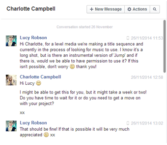
We used Facebook to contact Charlotte Campbell, a small unsigned artist, via her Facebook page to ask if we could use one of her songs for our title sequence and whether she had an instrumental version of the song we could use. She replied, saying that we had permission to use the song and that she would try and find the instrumental version to give to us. In the end, she wasn't able to find it so we used the original version. From this exchange we learnt that it was possible to contact artists and possibly get a response if we wanted to.
