Monday, 2 March 2015
Sunday, 1 March 2015
Evaluation 7: What do you feel you have learnt in the progression from the preliminary task to the title sequence?
In our preliminary task, we learnt how to use techniques that we hadn't used before - 180 degree rule, match on action, ellipsis and shot reverse shot. We managed to understand their concept and purpose quite quickly which meant that we were successfully able to use them in our short film. One example of this is when we used match on action, which is where two consecutive shots show the same action from a different angle or camera shot. We used this in our title sequence when we had a long shot of the students walking past and ignoring Megan, and then had a close up of her face in order to connote her confusion about the events. Another example is when we used ellipsis in the opening scene of our teen angst film. As the teacher entered the classroom, we see a long shot of her walking and then we see a mid shot of her sitting at her desk. It is clear that she has walked to her desk and sat down, despite the fact that this was not all shown on screen.
When we were editing our teen angst film, we learnt many editing techniques that we had not known while making our preliminary task. Firstly, we hadn't needed to add music to our preliminary task, however we did on our title sequence. Therefore, we learnt how to add music from iTunes and how to cut it down so that it fitted with the film. Another thing we learnt about editing while making our teen angst film was how to add titles. As well as learning how to insert titles and captions, and change their appearance, we learnt that that the titles were significant and could be used to connote. I learnt it was important to use colours that fits with your demographic and that some titles should be bigger and clearer than others because they are more important, such as the cast and crew names. Lastly, we learnt how to use transitions between shots as well as for the titles. It wasn't necessary to use this for our preliminary task. We used transitions between cuts to suggest a jump in time. For example, while Megan is walking towards the common room, their is a fade transition as she gets closer to the common room, showing a brief jump in time. We also used a swipe transition between the end of the title sequence and the beginning of the opening sequence.
We also carefully planned what props we should use. One prop we decided to use was a pile of papers that Megan carries at the beginning of the title sequence, because this suggests that she is in school. We could also use this prop to emphasise her fall and suggest that she is 'a mess'. Another prop we used was an iPhone, which many teenagers own. Not only was it important to represent the stereotype of a teenager but we also used it to create plot points in the film.
Another thing we learnt was the importance of settings. Settings can help attract an audience if they can relate to your target demographic. When filming our preliminary task, our setting was decided for us. However, the setting of our preliminary task fitted the dialogue and action. Having a school as a setting is a stereotypical convention of teen angst films, and after filming our preliminary task in a school we saw that it could be effective. This setting was relatable for teenagers, who were our target audience. We filmed in a corridor that had lockers in, as well as motivational posters on the wall which further suggests that a high school is the film location.
Furthermore, we did not think about costumes, props or make up when we were making our preliminary task, however we then learnt how important it was, as it can be used for connotations. For example, we planned for Megan to wear mainly red because this connoted danger and made her seem suspicious throughout the film. We wanted the rest of the characters to be wearing 'stereotypical teenage clothing', so we planned costumes, specifically for some of the main characters.

Lastly, we learnt that it is important to get good quality footage. In our preliminary task, we found that we had some minor issues with the sound which we could not change. Therefore, we learnt that it is best to film in a place where there will be no background noise. We also learnt if footage does not seem good enough, you should refilm it in order to get the best quality.
Saturday, 28 February 2015
Evaluation 6: What have you learnt about technologies and process of constructing this product?
We used many different technologies when constructing our film, to help us with planning, filming, editing and producing.

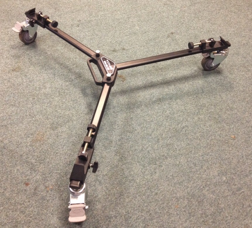
The camera, tripod and dolly were some of the most important pieces of equipment when creating our title sequence. This equipment was easily accessible as we could borrow it from school. None of our scenes involved filming outside of school so we didn't need to borrow any equipment however we learnt very quickly how to use the camera meaning that if we had needed to have taken it home then we wouldn't have had any issues in terms of knowing how to use it. While using the camera, we learnt how to achieve certain shots such as a close up and a long shot. Close up shots of the phone, for example, were very significant to the story. Therefore it was important that the shots were clear and good quality - if the writing on the texts was not readable then the story would not have made sense. We also learnt the importance of properly attaching the camera to the dolly as some of our footage ended up being extremely shaky because of this.
.JPG) The Apple Mac Computers were also incredibly important in terms of creating our title sequence as this was where we edited our footage. I had never used a Mac before so I learnt a lot from this. Firstly I simply learnt how to use a Mac - they were confusing at first because they are so different to PCs. However, we picked up on the basics very quickly (turning it on and off, logging in, opening the appropriate programmes). After a while we began to pick up on the short cuts on the keyboard which helped speed up the editing process. We learnt where pictures and other data we needed was stored on the system, making it easier to locate anything we needed for our film opening. Lastly, we learnt how to share our projects so that we could transfer them from the Mac to the school system.
The Apple Mac Computers were also incredibly important in terms of creating our title sequence as this was where we edited our footage. I had never used a Mac before so I learnt a lot from this. Firstly I simply learnt how to use a Mac - they were confusing at first because they are so different to PCs. However, we picked up on the basics very quickly (turning it on and off, logging in, opening the appropriate programmes). After a while we began to pick up on the short cuts on the keyboard which helped speed up the editing process. We learnt where pictures and other data we needed was stored on the system, making it easier to locate anything we needed for our film opening. Lastly, we learnt how to share our projects so that we could transfer them from the Mac to the school system. When using the Macs, we used Final Cut Pro X to edit our teen angst footage. When using Final Cut Pro, we learnt a range of editing techniques. For example, we learnt how to add transitions between shots and how to add titles. This was very useful because it helped us improve our title sequence and opening scene. We also learnt basics such as how to piece our film together by rearranging, cutting and deleting footage. When we realised that we'd filmed two shots with completely different lighting despite the fact that they were supposed to be edited into one another meaning that we had to either refilm or correct the colouring on the footage. Luckily, we realised that we could match the colouring between the two scenes so that the colouring was the same, so we learnt how to do that which helped us again later on in the editing process when the same thing happened again. This saved us from having to refilm a scene that took a long time to film in the first place. Lastly, we also learnt on Final Cut Pro how to speed up and slow down footage which we used at different points throughout the film.
We used a voice recorder to record our voiceover and was perhaps one of the simplest pieces of equipment that we used, however we still had to learn to use it. We learnt how to record, stop and playback our recording. This was useful because it meant we could add a voiceover to our title sequence, which is a convention of teen angst movies - it is used in Mean Girls and Easy A. It also meant that we could record our voiceovers for another part of our evaluation. We learnt that the voice recorder had a huge amount of storage space so recording more than once in order to get the right voiceover was not a problem.
 Blogger was a very important part of creating our film because we made all our planning and research on Blogger so that everything was in the same place. It was easily accessible from the computer, an iPad and a phone. However, we learnt that we could not access Blogger on our usual school accounts, as it was blocked. Therefore, we were all given separate media accounts on the school system. We also leant that Blogger only worked on Mozilla Firefox. We could use Blogger to receive feedback from our teachers, to help us improve. When using Blogger, we learnt how to add pictures, videos, and other links, as well as how to change the font, text size, text colour and text style. Another thing I learnt about Blogger was that it was very difficult to insert photos exactly where I wanted to which meant I had to adapt to this and find the most appropriate place to put the photo.
We used iTunes to download the song for our title sequence (Jump by Charlotte Campbell) after getting her permission on Facebook. However, we struggled to download the music and transfer it to Final Cut Pro. We learnt that we had to select the option of 'Trusting this Computer' if we wanted to download from my iTunes account via the Macs. At first we were unsure how to do this, so with permission we logged on to the admin account of the Mac. When this didn't work either, we looked at the settings, and realised that we could choose to trust the computer through that. Therefore, we learnt how to trust a computer on iTunes. We then learnt how to connect iTunes to Final Cut Pro and eventually we were able to add the music onto our film.
 We used USB memory stick to transfer our work from the Mac to the school system. I learnt how to share the work onto the memory stick and how important it was to properly eject the memory stick instead of just pulling it out of the Mac. As well as transferring work from the Mac to the memory stick, we also transferred work from the memory stick to the Mac. An example of this was when we put our production logo onto the memory stick so that we could put it onto our title sequence. Therefore, we learnt that the memory stick could be used not only to share files from the Mac but also the other way around.
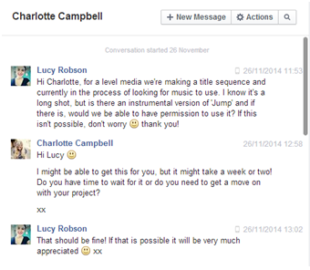
We used Facebook to contact Charlotte Campbell, a small unsigned artist, via her Facebook page to ask if we could use one of her songs for our title sequence and whether she had an instrumental version of the song we could use. She replied, saying that we had permission to use the song and that she would try and find the instrumental version to give to us. In the end, she wasn't able to find it so we used the original version. From this exchange we learnt that it was possible to contact artists and possibly get a response if we wanted to.
Tuesday, 17 February 2015
Evaluation 4: Who would be the audience for your media product?
Demographics
The film is aged at females between 15-20 year olds. Some of the themes within the film are too dark for anyone younger than 15. At 15, girls especially are becoming increasingly interested in fashion, make up and boys, while also beginning to value friendship more.
It is mainly aimed towards females, like teen angst films stereotypically are. The
main character is a teenage girl and the story follows her and her problems with trying to start afresh. It is aimed at working/middle class as the main character and her family are not upper class, and in fact struggle financially sometimes, making the film more relatable. The target audience would tend to only have a low level income, working a part time/saturday job. The film is aimed at all ethnicities, although potentially mostly British due to all the characters being British. The target audience members will be studying at GCSE/A Level/University.
Psychographics
The psychographics of our target audience includes many stereotypical features of a 'girly' teenager. For example, they enjoy socialising with friends, and may go with friends to see the film, and enjoy watching teen angst films and romantic comedies, meaning that they will want to come and see Rumour. They visit a lot of social media websites meaning that if we advertise properly they will have heard of and know a lot about the film, as well as being able to share views on it afterwards.
Tuesday, 10 February 2015
Evaluation 3: What kind of media institution might distribute your media product and why?
We will use QR codes as links to these social media pages that will be on most advertisements of the film, such as posters and trailers, letting people know that they are available for more information on the film. Posters or billboards would be displayed in public places, such as cities where there are more people to see it and somewhere that our target demographic is likely to see. For example, we may put a poster on a bus stop or at a cinema. Other advertisements like trailers would be shown in the cinema before the showing of another teen angst film, as this is likely to have a similar demographic watching and could therefore increase our publicity.
Friday, 6 February 2015
Evaluation 2: How does you media product represent particular social groups?
Our main character, Megan represented a new girl. She is seen as an outcast with very few friends. In many ways, she is similar to Cady Heron in Mean Girls. Both characters are new and seen as an outcast. However, they both makes friends with popular characters. Megan becomes friends with Ellie and Cady becomes friends with Regina. At some point in the film, both characters are disliked. An 'outsider' is a stereotypical character in teen angst films. There are differences between Cady and Megan however, because Cady becomes popular in Mean Girls, while Megan stays as a bit of an outcast despite becoming friends with Ellie

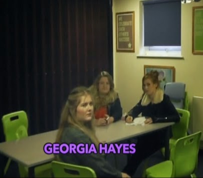
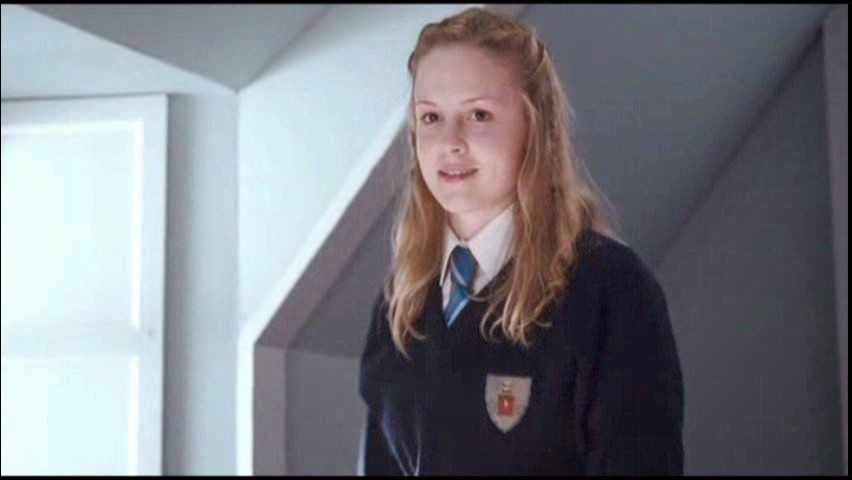


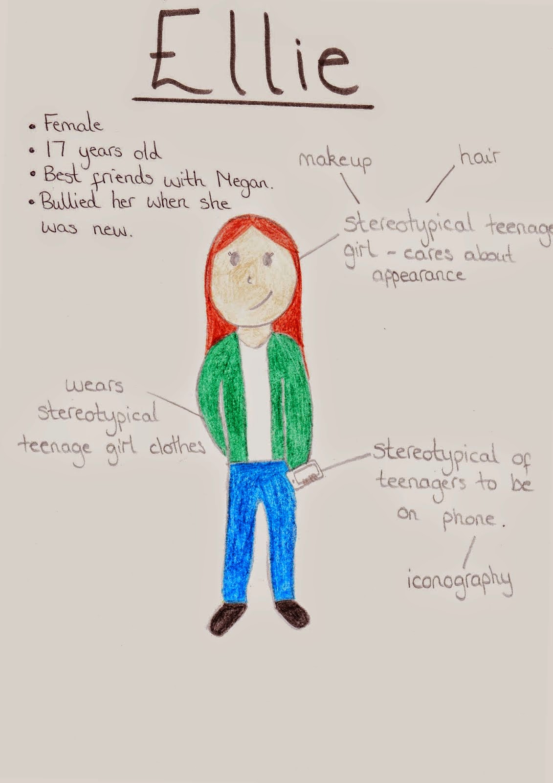
Ellie is represented as one of the 'populars' at the beginning of the film, and remains that way for the whole film despite being friends with Megan, who many people dislike. She is also smart and responsible, and gets good grades at school. She is similar to Kate from Wildchild. Kate befriends the new girl, Poppy, and Ellie befriends Megan. They both care about their appearance as well as their studies. The 'popular' girls are also frequently represented in teen angst films, normally as being very bitchy. At the beginning of the film, Ellie and her friends stare at Megan as if they are judging her and looking down on her. Although this is dissimilar to Kate's character, it is a stereotype of a lot of popular girls in teen angst films.


Aaron is the 'sidekick' to antagonist in our teen angst film. He doesn't necessarily want to bully the main character but does it to stay on the good side of the antagonist. He is similar to Ryan from High School Musical, because Ryan doesn't really want to be horrible to Gabriella and Troy, but his sister convinces him that he should. In addition, both characters care about their appearance. They both have hobbies however Aaron's is sport and Ryan's is musical theatre.
Sunday, 1 February 2015
Evaluation 1: In what ways does your media product use, develop or challenge forms and conventions of real media products?
Title
The first screenshot shows our film name: 'Rumour', as it appears in our opening scene. 'Rumour' is written in a sans serif font so that the title is clear and readable - it only comes onto the screen for a few seconds. The font size is larger to show its importance. It was positioned in the bottom left hand corner so that it didn't disrupt or block the footage, whilst still standing out due to it's size and colour. We decided to
make the title lilac, as our target audience is teenage girls and purple is a stereotypical 'girly' colour.
Setting/Location
Screenshot 2 is of the first shot of our title sequence. It is clearly set in a school corridor - this is obvious due to the lockers. This automatically makes the film relatable for our target audience because those targeted will be at school or will have left in recent years. We also included other school related locations in our title sequence and opening scene including the common room and a classroom.
Costumes and Props
We used a range of props in our title sequence and opening
scene. The third screenshot shows papers being thrown as Megan falls over –
this is an example of one of our props. The papers were used to emphasise Megan’s
fall. Also in the shot another prop is visible (the row of lockers). The locker
is important because they are stereotypically found in schools. Another prop we
used that isn’t in the shot is a phone. Teenagers are stereotypically using
their phones all the time so Megan using her phone in class is using a teen
angst convention.
Camerawork and Editing
We used a dolly for almost our entire title sequence - first for tracking and then for a point-of-view shot. The fourth screenshot shows Megan as she is being tracked. This is not necessarily a convention of teen angst films that can be used or challenged, however tracking is used in the Easy A title sequence. Using the dolly was a good idea in principle and gave us a good overall effect however the footage was incredibly shaky meaning the title sequence didn't look as polished as we would have hoped. For filming the rest of the footage, we just used a camera and a tripod and the shots did not require tracking so they came out a lot steadier. We used a range of shots, which is common in teen angst films.
Title Font and Style
For the titles we used 2 different fonts; the role within the making film is written in a white, serif font to make it catch the viewers eye. The names are written in a block sans serif font so they are easy
to read as this is most important. We used blocky coloured writing, inspired
by the title sequence in Juno. We also tried to match the colour of the
names with a colour used in the footage. We tried to match the colours
to colours already on the screen in order
to make the colours stand out further. This can be seen in screenshot 5 with the blue text matching the computer screens and the yellow matching the wall.
Story and How the Opening Sets It Up
Screenshot 6 shows a phone, with a text conversation on it. Many teen angst stories are about finding love, however ours does not focus on this, meaning we went against the stereotype. The phone shows Megan texting Hazel saying that she misses her. Megan then receives a text from her Mum, and she finds out her Mum is pregnant. Although pregnancy is common in teen angst films, it is uncommon for the mum to be pregnant.
Genre and How the Opening Suggests It
Screenshot 7 shows Megan sitting alone with lots of her classmates sitting away from her. This suggests that she is either new or unpopular, and having a new or unpopular main character is stereotypical of a teen angst film, therefore this shot suggests the genre.
How Characters Are Introduced
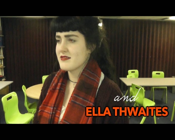
Two of the most important characters, Ellie and James are in the title sequence. James runs into her, knocking her over, which shows that he is going to cause problems for Megan. On the other hand, Ellie who ends up being Megan's best friend, is not as kind to her in the title sequence. She laughs at her and deliberately bumps into her. Most of the main characters are in the title sequence, and the most important characters have the actors name underneath.
Special Effects
We used a range of special effects in the title sequence. The first special effect we used in the title sequence was slow motion and fast motion. We used this many times. We first used slow motion when Megan falls over - the slow motion emphasises the fall as the papers fly everywhere. It exaggerates the fact that she is having a bad day, and the main character having a bad day at the start of a film is a convention that we chose to follow. We also use it when introducing the characters for the first time. The camera goes slow over the characters and fast in between them so that the main focus is on the characters.
Another special effect we use are transitions between shots. An example of this is when there is a fade between two tracking shots. The fade acts as an ellipses and shows that a small amount of time has passed. We also used a swipe transition between the title sequence and the opening scene, showing that the time and location had changed.
Lastly, we used transitions for the titles. They fade on to the screen and then off again, meaning that they aren't in focus for very long. We found this effective because it meant that the titles weren't distracting the audience from the action on screen but was still readable if the viewer wanted to read it. Screenshot 9 shows a title while it is fully on display.
Thursday, 15 January 2015
Title Sequence Draft Feedback
After showing the first draft of our title sequence to the class, we got the following feedback and made some changes:
- Change the font of the title: we changed the title 'Rumour' from a blocky font to a font that looked handwriting, which fitted with the theme of school.
- Add more colour to the titles: as most of the writing on screen was originally white, we changed the names of the cast and crew to bright colours.
- Shorten the shot time on the phone: the length of time that we showed shots of the phone in the opening scene were too long so we cut them down considerably so that the pace of the film didn't get too slow.
- Remove sound from production logo section and don't zoom in: we removed the twinkly sound that accompanied our production logo because it didn't fit with the logo or the film. We also stopped it from zooming in on the star because this made it seem too pixelated. In the end, we found that it was a better idea to redesign the production logo to make it clearer and more presentable.
Subscribe to:
Comments (Atom)


