Wednesday 31 December 2014

Shotlist

Our original shotlist plan was:

Tracking (through corridor)
Close up (Megan)
-----------------------------
Tracking (classroom, legs)
Mid shot (Megan)
Over the shoulder (phone)
Mid shot (teacher)
Over the shoulder (phone)
Mid shot (Megan)
Over the shoulder (phone)
Mid shot (teacher)
Mid shot (Megan)

However, we found that when we came to film and later to edit, this order wasn't quite right. Our final shotlist is as follows: 


Tracking down corridor (12 seconds)


Tracking into common room (7 seconds)

Point-of-view around characters (22 seconds)


Long shot as bell rings (12 seconds)


Close up of Megan (2 seconds)

Mid shot of Megan in class (2 seconds)

Establishing shot of class (2 seconds)


Extreme close up messages to Hazel (11 seconds)


Mid shot teacher at door (3 seconds)

Long shot teacher entering (2 seconds)


Over-the-shoulder of teacher  (2 seconds)


Extreme close up message from mum (2 seconds)


Over-the-shoulder of teacher (1 second)


Mid shot of Megan (2 seconds)

Over-the-shoulder of teacher (8 seconds)


Mid shot of Megan (2 seconds)


Tuesday 30 December 2014

Planning Changes

Plot
One of the main plot points in our film is our main character Megan's mum's pregnancy. When we originally planned our plot, we thought that Megan should find out about this pregnancy about halfway through the the film. However, we then decided that we wanted to introduce this storyline within the opening scene, so that it could be an ongoing issue for Megan throughout this film. In addition, we also wanted to show this storyline in our final product and we were only filming the title sequence and opening scene.


Title Sequence
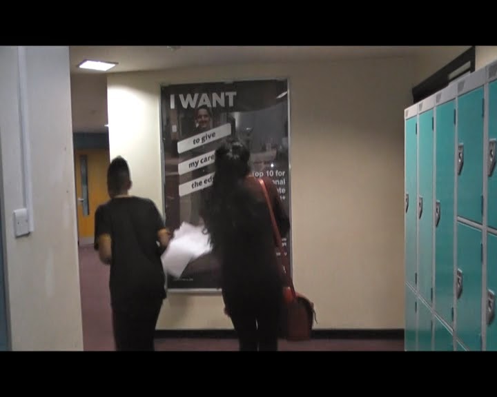
The main idea of our title sequence did not change, as we always planned to track down the corridor and into the common room. We also planned for one character to run straight in to Megan, causing her to fall over, as this is common in teen angst films. However, when we started filming we decided that we should begin with the main character getting school work out of a locker, which showed that she was at school. Lockers are stereotypically used in teen angst films to represent the location as being at school. This can be seen in films like Juno.  We also shortened the distance that the camera tracks behind Megan in the corridor because we realised it would take too long and it wouldn't be possible to film good quality footage due to some obstructions on the floor.


Opening Scene
Originally, our opening scene was going to start with a shot of Megan's legs underneath the table, before tracking/panning across to show that she was sitting alone whereas everyone else was sitting in groups. We then planned to have Megan texting 'Hazel' during lesson with messages suggesting to the audience that there had been some sort of incident regarding Hazel that meant that Megan no longer sees her. The teacher tells her off for being on her phone making the rest of the class laugh at her. However, after struggling with the filming of tracking on the title sequence, we decided not to track at the beginning of our opening scene. Instead, we just used a close up of Megan, and then a long shot of the classroom to illustrate that she is sitting alone. We also decided to include Megan receiving a text from her mum telling her that she is pregnant. We also decided not to have the class laughing at her when she gets told to put her phone away because we decided that we wanted to start off with people just ignoring Megan, rather than bullying her straight away.


Monday 29 December 2014

Editing

To edit our film we used Final Cut Pro X on the Apple Macs. We decided which clips were usable (as some of our footage was too shaky) and arranged them into the right order. We then cut down each clip so that only the relevant footage was in the film. 


We realised that two of our clips had completely different lighting from each other, which was an issue because the clips were supposed to cut into each other as if they were filmed at the same time. Therefore, we had to use the colour correction element of Final Cut Pro X. This was successful, and once we had edited one of the clips, the lighting appeared to be the same for both.

Once we had corrected the colouring and ensured that we had the correct clips in the right order, we were able to start adding special effects to our title sequence. An example of this is the slow motion we used when Megan is pushed over. The papers that she is holding go everywhere, and the use of slow motion emphasised this fall. We also used slow motion during the section of the title sequence where Megan is looking around at her peers, and they are all staring back at her. The slow motion means that there is more of a focus on the actors/characters. We then used fast motion to speed up the panning between the groups of people as this was a lot less significant. 

We added transitions between some of the clips. An example of this is when the camera is tracking Megan. The shot fades into the next shot of Megan walking slightly further up the corridor. This transition showed an ellipsis between the two shots.


Monday 22 December 2014

Props and Costume

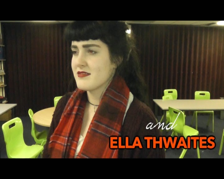
We wanted our film to look as authentic as possible therefore we asked our actors to wear what they would normally wear to Sixth Form. Students were dressed in their own clothes. Megan, played by Ella Thwaites, was wearing a red cardigan in order to connote a warning. Although Megan is the protagonist, the red in her outfit shows that she could be dangerous. This is proven later in the film when it transpires that she was responsible for the death of her best friend. We decided that Megan would wear make up, not only because she cares about her appearance but because she wants to cover up the secrets of her past. 

Props used in our film include:
-A phone; in order to do the texting section of the first scene, we had to find the right phone. We decided that an iPhone would be best because we could use iMessage, which meant we could show when a character was typing. We used my phone, and changed two of my contacts, one to say 'Hazel' and one to say 'Mum'. We also had to ensure that the contact 'Mum' was able to text back, so a fellow group member used her phone to reply. It is a stereotype that teenagers use their phones a lot so Megan using it in class
-Papers; we wanted Megan to fall over in the title sequence, which is typical in teen angst. To emphasise the fall, Megan held papers with work on that she would drop as she was pushed. 
-Locker and locker key; at the beginning of the title sequence Megan is closing and locking a locker. Lockers are seen in lots of teen angst films such as Juno, and is a stereotypical setting for a teen angst film because it suggests that it is set in a high school. 

Saturday 20 December 2014

Title

We chose the name 'Rumour' for our film, however we struggled for a long time to find a suitable title. Although the name 'Rumour' appears to suggest that there was only one rumour, this is not the case as there are several throughout the film. Instead, we chose the name 'Rumour' because a lot of what is said in the film is based on rumour, as a concept, rather than individual rumours. 

Thursday 18 December 2014

Fonts and Titles


The opening credits of our film include bright colours as well as white. The bright colours of the names represents the vibrancy and high energy of the stereotypical teenage lifestyle. However, the white writing is a contrast and this juxtaposition suggests that teenagers also have more boring and calmer parts of their life. We based our brightly coloured title sequence on the title sequence from Juno.


Our main title is in lilac, because our target demographic is females and lilac is stereotypically a female colour. In addition, we chose a font that looked like handwriting, because our film was mainly set at school, and a key element of school is writing. 


Music and Sound

We struggled to find music that really fitted with our opening sequence. During our pitch, we said that we either wanted 'rock music', and I found a piece of music called 'Beverly Bells' which we thought might have fitted. Our other idea was to contact an artist called Charlotte Campbell and ask if she had an instrumental version of her song 'Jump' that we could have permission to use.


Although she said we could, she was unable to find the instrumental version of that track. We then asked for her permission to use the regular version of 'Jump' and she said we could. We found that some of the lyrics fitted with the plot of the film, such as "she used to be one of us", which suggests that Megan, the main character, is an outcast. 'Jump' is a very bouncy and upbeat song. We decided to use a song like this because this is a stereotype of teen angst films. Most title sequences of teen angst films have music similar to this, such as 'Angus, Thongs and Perfect Snogging', which uses 'She's So Lovely' by Scouting for Girls. It sets a happy atmosphere and connotes positivity, and teen angst typically have a positive message, despite the drama that occurs throughout.

We also added the sound effect of a school bell ringing, to connote once again that the film was set at a school. After the bell rings, all students apart from Megan go to lesson which shows she is new and is unsure of what do to or where to go.

Our Production Logo


Our Production Company name is 'Skyward Studios'. The name was chosen to suggest that the company is always improving and 'heading for the sky'. We wanted to use the sky in our logo as this fitted our name, and we also knew that we wanted a star, because this fits with the idea of the sky. This can be seen in our original logo plan.


 The blue in the logo is bright and positive, and will draw people's attention to it. The gold writing connotes high quality and the serif font suggests the creativity that the company aims to demonstrate. In addition, we used a star to connote fame and success as well as the 'stars' in our productions. Although we liked this logo, we found that it was far too pixelated when we came to putting it into our film. Therefore, we had to redesign our logo.


Although we wanted to keep it fairly similar, it was decided that we would change the images on the logo to avoid it being too pixelated, as this would look unprofessional. Our final logo was very similar and we kept the key characteristics such as the gold serif writing and the blue background. 


Wednesday 17 December 2014

Script

The original script for our opening scene was:

Megan: (to Hazel’s phone)
                *I’m sorry*
                *I miss you*
                *I didn’t mean to*
                *If I could go back and change things then I would*
Mum: (to Megan’s phone)
                *GUESS WHAT!*
Megan: (to Mum’s phone)
                *What?*
Mum: (to Megan’s phone)
*I’M PREGNANT!*
Teacher:  Excuse, me, um, new girl, what is your name?
Megan: It’s Megan
Teacher: Well I don’t know what the rules at your old school Megan, but here we don’t go on our phones in class
Megan: Sorry Miss


We did not use this exact script, although we followed the general idea of it. We decided to let the actors choose the exact wording of their dialogue to make the acting seem as natural as possible.

Sunday 14 December 2014

Characters

Our main character is called Megan, however we originally considered the names Jessica, Claudia and Lucy. We wanted to find a typically girly name that fitted the teen angst genre. 


Megan cares a lot about her appearance, which is stereotypical of a teenage girl and is seen in many teen angst films such as Poppy in Wild Child. She wears a lot of red, to connote danger. She has a secret, which is that she was involved in a car crash that killed her best friend Hazel. Although she wasn't at fault in the crash, she was the one who had convinced Hazel to go out in the car with her, meaning that she feels at fault. Megan spends 17 years of her life as an only child, but on her first day at her new school, she receives a text from her Mum who tells her that she is pregnant, meaning that Megan will have a younger brother or sister in the near future. Megan is starting a new school, which is another convention of teen angst films (e.g. Poppy in Wild Child, Cady in Mean Girls and Annabelle in St Trinian's). A few days in to starting her new school, she befriends Ellie. She is played by Ella Thwaites. 


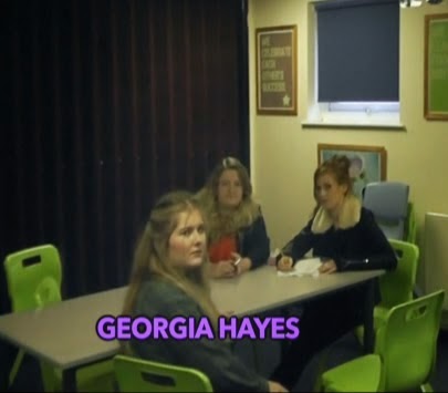
Ellie becomes Megan's best friend throughout the duration of the film. We chose the name Ellie because it sounds very friendly. The character is very accepting and understanding and quickly befriends Megan when she sees that she is lonely, despite laughing at her and walking into her deliberately at the beginning. Although Ellie and Megan argue when Ellie finds out Megan's secret, the reconcile when Ellie realises how awful Megan feels and how sorry she is. Like Megan, Ellie cares about her appearance like a stereotypical teenage girl. Ellie is dating Aaron in the film, but breaks up with him when she discovers that he is bullying Megan. She is played by Georgia Hayes.


We chose the name 'James' because it is a common male name. James is seen pushing Megan over at the beginning of the title sequence, which immediately suggests that he is causing to cause problems for Megan throughout the film and connotes that he isn't a nice character who cares about other people. James is the main bully in the film, and starts and spreads all the rumours about Megan. Usually, the main male character in a teen angst film is a love interest throughout the film, for example in Angus, Thongs and Perfect Snogging, Georgia's main focus is Robbie. We decided to break this convention and only have James admit his feelings for Megan at the end of the film. However, Megan rejects him because he spent so long bullying her. James is played by Sean Kaitano.


Aaron, James' best friend was another character who bullied Megan. Once again, we chose the name Aaron because it is a common male name. He is dating Ellie but she breaks up with him because of the way he treated Megan. He is a stereotypical teenage boy, with interests in his appearance and sport. He is played by Joe Fraser.


Hazel was Megan's best friend, however she died in the car crash. Megan blames herself for Hazel's death, despite not actually causing the car crash. This was because Megan had persuaded Hazel to get in the car with her so they could go out rather than staying in. Megan is seen texting Hazel's phone in the first scene, saying 'I miss you' and 'I'm sorry', which shows the remorse the Megan feels towards the death of her best friend. Although Hazel isn't a common name for teenage girls, we decided to use it because we thought it fitted with the unusual and unrelatable events that occur. She does not appear in the main sections of the film, only in flashbacks and dreams.

Lisa is Megan's mum, who is pregnant throughout the film. She reveals this fact to Megan in the first scene as she texts her. She has remarried, meaning that the unborn baby will be Megan's half sister. We chose the name Lisa because it is a common name of that generation. 

Miss Scott is one of Megan's teacher, featured in the first scene. Although they have a disagreement in the first scene, Miss Scott ends up being one of Megan's favourite teachers. Consequently, Megan ends up confessing her secret to her. Miss Scott supports Megan as she tries to move on with her life.


Movie Plot

The movie focuses on a girl called Megan, joining a new school with a big secret. At first most people think she is odd so ignore her, but after a while rumours begin to spread. She befriends the popular Ellie, who does her best to defend her to those saying nasty things.  In the first scene, Megan finds out that her Mum is pregnant which makes her feel unwanted at home - her mum and step-dad are focusing on the bump. As Megan never wants to disclose why she left her old school, people find her odd and suspicious. Consequently, people make up rumours about why she left and she starts to get bullied. 

Megan eventually admits to her teacher Miss Scott that she was involved in a car crash that killed her best friend. Aaron overhears her confession and tells Ellie and James. While Ellie argues with Megan about it, James tells everyone about what he has heard. Ellie forgives Megan as she explains exactly what happened. Megan had convinced Hazel to go out with her when she just wanted to stay in, and while they were out in the car, they were involved in a crash. Ellie breaks up with Aaron.

In an assembly, Megan talks about the crash and how devastated and guilty she feels, and her classmates begin to understand what happened. James admits to Megan that he likes her and asks her to be his girlfriend, but she rejects him because of how he had treated her.

Friday 12 December 2014

Settings in our film

Almost all our film is set in a secondary school, therefore we felt that it was important to represent this in our title sequence and opening scene. After researching the representation of schools in teen angst films, we decided to use a locker to connote a school environment, and a classroom to do the same. We decided to set our film in a 'high school' because this would be relevant to our demographic of 15-20 year olds. This audience will either still be in school or will have only left recently, making it relatable. Our first shot is in a corridor with lockers, which is a stereotypical prop in a secondary school, so this immediately sets the scene and informs the viewer of where the film is set. Lockers are seen in teen angst films such as Juno.


We filmed some of our title sequence in our common room. We wanted to show groups of students grouped together, like in Mean Girls in the cafeteria. Although this room may not be immediately recognisable as part of a school, this is suggested by the tables and chairs, as well as the iconography on the walls.


Classrooms are another recognisable feature of schools, because all schools have them, so this was another setting we used to represent the location of the film. When researching teen angst settings, I found that both Mean Girls and Angus, Thongs and Perfect Snogging had scenes in a classroom. This is clearly a classroom due to the layout of the table and chairs, as well as the whiteboard. 


Tuesday 9 December 2014

Target Audience and USP

Originally, we decided that our target audience should be around 12-20 year old females, which is the typical target audience for a teen angst film. However due to some dark themes within the film (the main character causing a car crash which consequently lead to her best friend’s death), we decided that the film certificate would be 15, meaning our target audience would be 15-20 year old females instead. This decision came from feedback from our classmates after we pitched our idea to them. Although this would perhaps limit the amount of people who would see the film, it is important that the film is only viewed by those it is appropriate for. 

Our USP is the fact that our target audience is different to other teen angst films, as the certification is a 15. 'Angus, Thongs and Perfect Snogging' is rated a 12, as is Wild Child, Mean Girls and Juno, which shows that the stereotypical target audience for films of this genre is 12-20.

Saturday 6 December 2014

Risk Assessment

Risk:
Method to overcome this:
Ella could get hurt when Sean pushes her over
Ensure that Sean  is careful when he knocks into her and that Ella is in full control of her fall over.
The camera fall during filming.
Make sure that the tripod and camera are secure at all times.
A crew member could trip over the dolly during tracking shots.
Make sure that everyone looks exactly where they are going when near the dolly.
When manoeuvring the dolly, a crew member could lose control of it. It may hit a wall or another crew member.
Be very careful with the dolly and make sure a second crew member is on standby in case someone loses control of the dolly.

Thursday 4 December 2014

Initial Storyboards

Below are the storyboards for our title sequence. We tried to follow it as much as we possibly could, and I believe that we have. Although our storyboards don't include very much detail on camera shots and editing, it gave us a good idea of what we wanted to film and the shots we might need. 

The following pictures show the storyboards for our first scene. Once again, the storyboard isn't hugely detailed but it gave us a structure for future planning.

Wednesday 3 December 2014

First Pitch


Feedback:
-If car crash scene is to be included, raise demographic age from 12 to 15 as scenes may be too dark for a 12 certification: we decided to change our target audience to 15-20 so as not to offend or upset younger viewers and therefore changed the certification to a 15.

-Create more sub-plots so that there is more happening and develop narrative: we created the storyline of Megan's mother being pregnant (and we decided to introduce this in the first scene when Megan's mum texts her to tell her that she is pregnant). We also created the storyline of James, the boy who bullies Megan and spreads rumours about her, liking Megan and admitting his feelings towards the end of the film. This storyline, however, was not hinted at in the title sequence or the opening scene.


Saturday 15 November 2014

Easy A Title Sequence


Easy A
0:09 - "Screen Gems, a Sony Pictures Entertainment Company."  centre of screen, sans serif font, blue text, no other text on screen
0:15 - "Screen Gems Presents" - no other text on screen so it is important, middle-left of the screen, in capitals which shows importance, "Screen Gems" is bigger, blue font, overlaying an establishing shot of a town
0:24 - "An Olive Bridge Entertainment Production" - sans serif font in white which contrasts with background and is not the same as previous titles, top of the screen, audience will pay attention because only important thing to look at
0:30 - "A Will Guck Film" - 'Will Guck' is bigger than the other text showing importance, in sans serif font, white font, 
0:35 - "Easy A" - Main title, both serif and sans serif font, white and red font, the 'A' is serif font to look like a girls handwriting relating to the characters, shoes in tree on the screen showing rebellion within school and characters/plot, school bell is heard connoting a school setting, previous shot shows of "Ojai North High School" setting the scene further.
0:45-1:41 - Cast names (e.g. Amanda Bynes, Thomas Haden Church) The names are placed within the scene suggesting that they are most likely cast names. They are spread throughout the shot, and can be seen via a PoV, suggesting that a student is walking through the grounds, all text in white, sans serif font and all same size showing that they are all as important, voice-over begins to set the story up.
1:44 - "And Emma Stone" - White font, sans serif font, title is next to character displayed in the shot which suggests it is her, both on floor showing she is perceived as inferior to other characters despite being the main character - she is the last cast title and is doing the voice-over .

2:20 - "Casting By Lisa Miller Katz csa" - bottom-left on screen shows less importance than the first few titles, sans serif font, white, characters arm covers the csa at one point.
2:31 - "Costume Designer Mynka Draper" - white text, sans serif font, side of the screen because events on screen are more important.
2:45 - "Music Supervisor Wende Crowley" - white text, sans serif font,to the side of the screen as less important than the content on the screen.
2:50 - "Edited By Susan Littenburg" - White text, sans serif font, bottom of the screen so still visible but again, not as important as screen content.
2:57 - "Production Designer Marcia Hinds" - White text, sans serif font, bottom of screen, out of the way of contents but still important enough to be shown.
3:10 - "Director of Photography Michael Grady"- White text, sans serif font, bottom of screen so less important and out of the way of the story, at an angle as if sitting on the ground, behind character as she covers it up at some points.
3:36 - "Produced by Zanne Devine, Will Gluck" White sans serif font, placed on a sign in the background to blend in with the scene and allows audience to pay attention to content on screen while keeping the title sequence interesting.
3:51 - "Written By Bert V. Royal" - White text, sans serif font, more central screen as it is a significant role in the film.